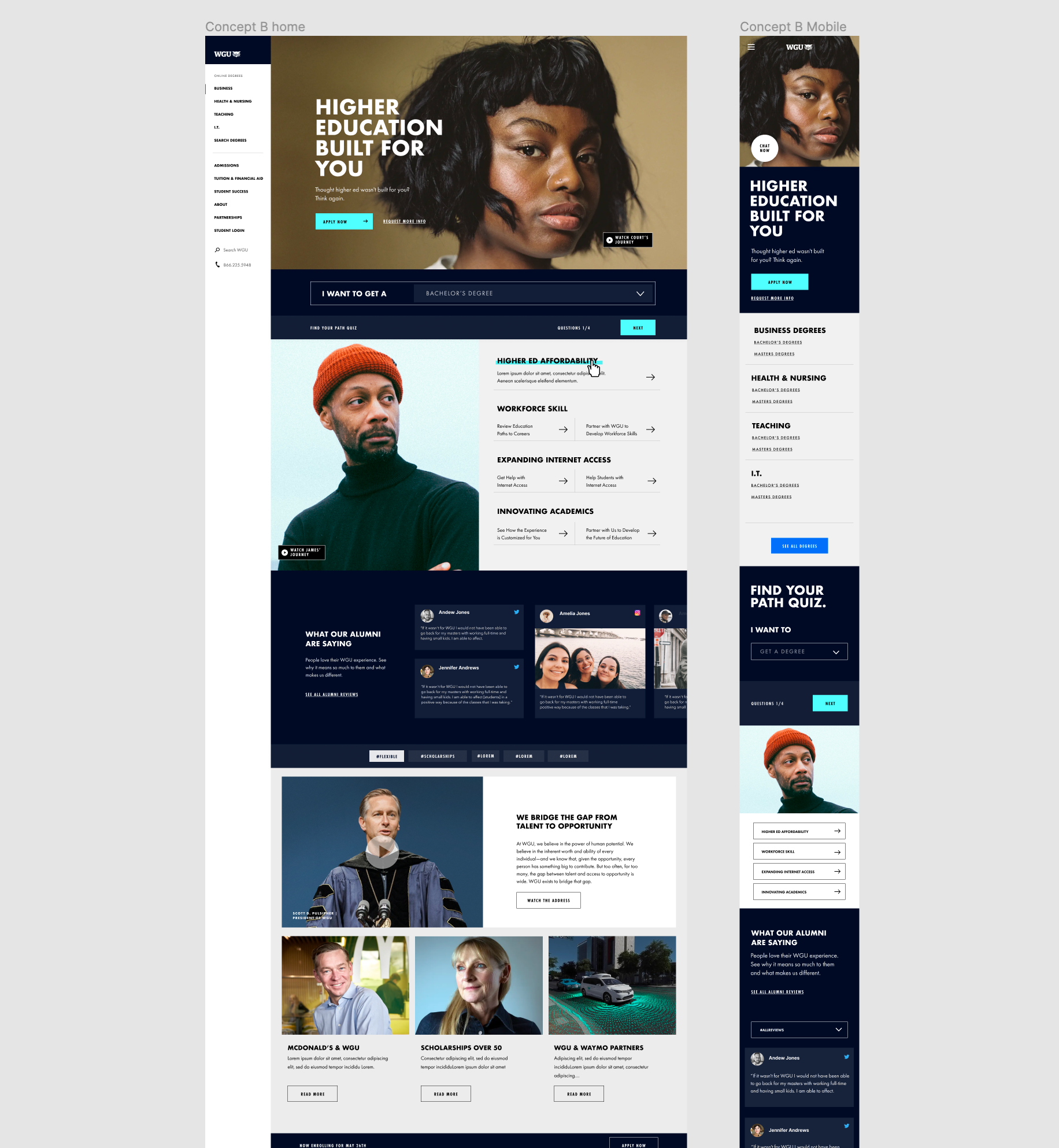
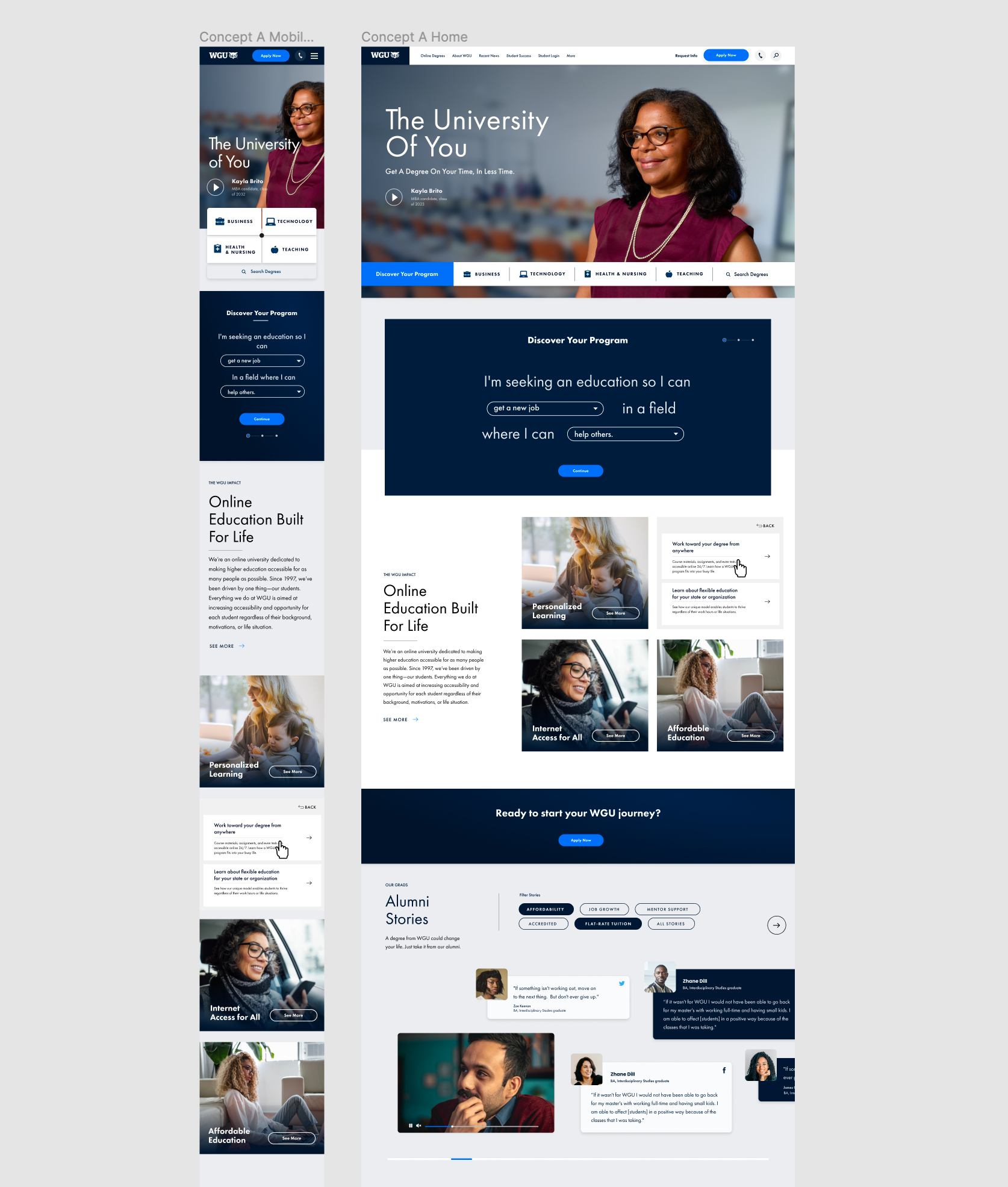
In designing for a new site we wanted to push the brand. We needed colors and styles that were more web and performance friendly. We needed to separate our brand from other universities to show off some of our differentiators. We are a university that lets you work at your pace. Meaning you can pass as many classes as you want in a semester. Potentially saving you money and time.
Another challenge was designing for several different audiences that visit the home page. We had to have clear paths in their primary needs.
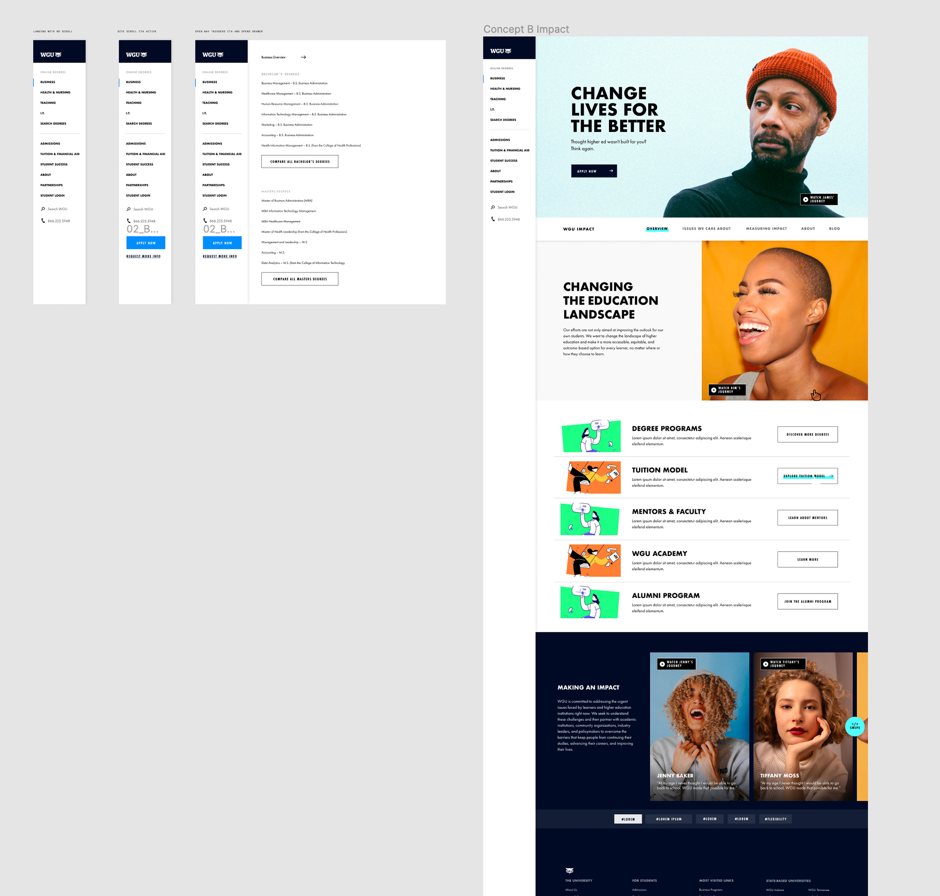
In Concept B we wanted to push fonts and photos. we wanted to make the site feel more modern by adding color through photography. Bringing in social platforms for reviews is something you'd never see on traditional university sites.
The menu on this concept was my favorite choice because you can clearly navigate from any section of the site at all times. This solution resolved a lot of potential pain points revolving around differing audiences. The menu is meant to be sticky as you scroll.